Tuesday, April 13, 2010

Texting

Texting is a contemporary form of communication - we use text everyday, to decipher meaning, to guide us, to connect.... So, why shouldn't we use it in our artwork?

There are many artists who have a text-based practice. Looking to Pop art in the 60's and 70's we find artists like Ed Ruscha and Roy Lichtenstein not only using text, but using imagery and process' from an emerging "popular culture."


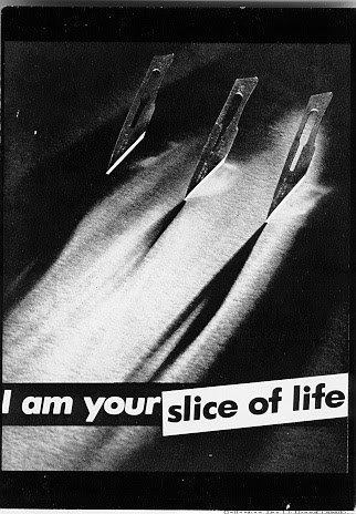
Moving forward into the 80's, feminist artists like Barbara Kruger and The Guerrilla Girls paired relevant imagery with bold statements to convey their criticism of sexism and the circulation of power within cultures.


Contemporary artists have been using text in an interactive way, combining architecture and text.
The artists are, in a way, narrating your experience of/in that space.


You can communicate in a different way using text in your art. First you must come up with a concept. What do you want to say? What imagery will accompany your text? Will the imagery support or oppose the imagery? How will your layout effect the message? Think about your concept and do some preparatory sketches. The finished piece with be an 18"x24" drawing on the heavyweight white drawing paper, using any of the materials we've used in class (graphite, charcoal, pen). Be prepared to discuss your concept and process in the critique.

Thursday, April 8, 2010

Homework #12 (Assigned 4/1 - Due 4/13)

-Metamorphosis
-5 step transformation
-Transform yourself (your portrait, your entire body, just your hands...) into another thing (a
bird, an umbrella, a stapler, a pineapple...)
-Think about your concept, your layout, your technique, and your medium
-Full sheet of heavyweight white drawing paper
-Medium of your choice

Homework #11 (Assigned 3/18 - Due 3/23)

-Two-Point Perspective Interior
-Full sheet heavyweight white drawing paper
-Graphite
Homework #10 (Assigned 3/16 - Due 3/18)

-10 Two-Point Perspective Boxes
Two-Point Perspective

Instead of viewing a box straight on, as in one-point perspective, we are viewing it at an angle. Two-point perspective describes objects that are oblique, or turned at an angle to the picture plane. No planes of the cube or cube-like form are parallel to the picture plane.

In one-point perspective, the height and width of the object are parallel to the picture plane. In two-point perspective, the height only is parallel to the picture plane. Verticals all remain parallel to the vertical edges of the picture plane, but the two sides of the box lea
d to two vanishing points, one on the right and one on the left.

The vanishing point for one-point perspective is located in the picture plane because parallel edges in the subject are angling sharply away from the picture plane. The vanishing points for two-point perspective are often located some distance away from the drawing, out of the picture plane, to the left and right because the two sets of parallel edges in the subject are angling slightly away from the picture plane.


The location of the vanishing point left (VPL) or the vanishing point right (VPR) for any given set of parallel edges of the subject depends on two factors.

One, the angle between the edges in the subject and picture plane. The closer the edges are to being parallel to the picture plane, the farther away to the left or right the vanishing point (VP) for those edges will be. If the edges of the subject seem to be parallel to the picture plane and not converged in the drawing, it is because the VP for the edges is, in effect, an infinite distance away.

Two, the distance between the observer and the subject. The closer you are to the subject, the closer the VP's are going to be to the center of the subject in the drawing. The farther away you are from the subject, the farther away and the farther apart are its vanishing points in your drawing.

Homework #9 (Assigned 3/11 - Due 3/16)

-One-Point Perspective Interior
-Draw an interior (i.e. hallway, kitchen, bathroom, living room...) in 1pt linear perspective
-Full sheet of heavyweight white drawing paper
-Graphite
-Leave receding lines, horizon line, and vanishing point
Homework #8 (Assigned 3/9 - Due 3/11)

-10 One-Point Perspective Boxes
-5 stacked
-3 cylinders
-1 odd shape
Homework #7 (Assigned 3/4 - Due 3/9)

-Frankendrawing
-Combine 7 objects/items from home to create 1 seamless creature
-Invent/create and environment for it to exist in
-Full sheet of heavyweight white drawing paper
-Medium of your choice

Homework #6 (Assigned 2/25 - Due 3/2)

-1 Glass and 1 Spoon
-Arrange one glass glass and one metal spoon together
-Include the surface and background
-Full sheet of heavyweight white drawing paper
-Graphite

One-point Perspective

In one-point perspective, one "face" or plane or side of a cube or cube-like form is parallel to the picture plane, facing the observer directly. The left and right sides as well as the top and the bottom of the cube all converge on a single vanishing point located on the horizon line/eye level. Edges perpendicular to the picture plane converge on a single vanishing point, while all vertical edges are parallel to the picture plane and remain vertical with no evidence of convergence.

The easiest way to understand one-point perspective is to envision converging railroad tracks or a sidewalk retreating in the distance.


For one-point perspective to function correctly, the observer must do several things. Position yourself parallel to the subject (i.e. buildings or walls). Maintain your position/station point. Maintain your line of vision.

You must remain in a fixed position throughout the drawing because ever time you move your head, even just your eyes, up and down or side to side you change your point of view and the drawing loses consistency and therefore its credibility.
Perspective

Perspective drawing is a system for creating a two-dimensional illusion of a three-dimensional subject or space. Information, whether it's observed or imagined, is translated into a system that allows three-dimensional forms and space to be represented on a two-dimensional surface; creating the appearance of viewing real space on a page.

Perspective theory is often separated into two parts, linear perspective, and atmospheric perspective.

Linear perspective addresses how the shapes, ed
ges and sizes of objects change in appearance when seen at different positions relative to the observer. The distance between the object and the observer, the rotation and elevation of the object, and the viewing angle of the observer are all important in linear perspective. The location of the horizon line, the eye level of the observer, the line of sight of the observer, the location of vanishing points, and the use of trace points and receding lines are key to this practice as well.

Atmospheric perspective is used to identify other characteristics that convey how near of far an object is from the observer. A veil of atmospheric haze usually reduces the visibility of far away objects. With distance, detail is obscured, contrast is reduce
d and color is less intense.


The basics of perspective have been known since ancient times; overlapping, diminishing size, and atmospheric perspective can be found in art well over 1,000 years old. It wasn't until the 14th century that perspective theory was analyzed in depth and its principles were developed to a high degree of sophistication. Filippo Brunelleschi, the Italian Renaissance architect, is credited with the invention of linear perspective, the system of translating three dimensions into two. Some say it was really an invention from the Dutch artists of the time and Dutch painters of the 15th and 16th centuries really brought the illusion to its peak.

All perspective drawings have two major characteristics that create a sense of space, depth, and volume. One is convergence; the apparent diminishing distance between parallel edges of an object as they move farther away from the observer. Parallel lines seem to come together in the distance, eventually meeting at the horizon. The other is foreshortening; the apparent diminishing size of the width or height of an object as it angles away from the observer. Sides and tops of objects seem to get shorter and flatter as they move away.
Homework #5 (Assigned 2/18 - Due 2/23)

-2 Kitchen Items
-Choose any two items in your kitchen and compose a drawing
-Include the surface and background
-Use a full range of value
-Full sheet of the heavyweight white drawing paper
-Graphite and charcoal
Homework #4 (Assigned 2/11 - Due 2/16)

-Local value collage
-Complete the collage started in class
Homework #3 (Assigned 2/4 - Due 2/9)

-10pt Value Scale
-Create a 10pt value scale for each of our 3 mediums (graphite, charcoal, pen)
-The white of the paper will be your first step and black will be your last step, with
shades of gray in between
-Create subtle, yet distinct shifts in value as you progress through the scale
-Use a half sheet of the heavyweight white drawing paper


Transparent and Reflective Surfaces

The look of glass, plastic, metallic or glazed surfaces can be achieved in a drawing through careful observation and meticulous recording.

Identify the different areas of value, their shape and location in relation to the perimeters of the object and each other, as well as the hardness or softness of their edges. Think about drawing a topographical map, recording each shift in terrain, the terrain being value. Lightly outline each area of value on the surface and then apply those values.

Try not to make your drawn object "look" like glass or chrome or any other transparent or reflective surface. Instead, focus on accurate form and careful observations and placement of information, and the materiality of your subject will come through.

Monday, February 15, 2010

Color Into Value

Value describes achromatic color, that is,
color devoid of hue. So, how do we translate objects that are full of color in real life into black and gray drawings? You have to look at the lightness and darkness of a color in order to determine its value. Keep in mind that color is separate from value; a red tie and a blue suit may be different hues, but they may share the same value.

In this illustration please find one linear grayscale and two gray "wheels". One of the wheels is a true grayscale, while the other is a color wheel converted into a grayscale. Can you see the translation of color into value? (NOTE: This example is truly affective when the student has knowledge of what a color wheel looks like.)

This fabric collage provides a clear example of that translation, and the idea that color is separate from value.
Local Value

Value is determined by the inherent color of a
form and by the amount of light falling on a form. Local value is intrinsic to an object and is separate from the lights and darks created by light falling on that object. For example, the local value of an egg is white and the local value of a crow is black.
Light Logic

Observing the way light interacts with an object or group of objects, noticing shadows and the resulting variations in value, is light logic. Think about how light falls on spheres, cylinders, cones, and organic volumes creating a gradual change from light to dark over their surfaces. Alternatively, cubes, pyramids, and other angular forms change abruptly from light to dark at the intersections of their planes. The intensity of shadows and how clean their edges are is directly related to the strength of the light and its proximity to an object.


Light and shadow on a volume can be reduced to six categories, of course each subject requires more specific investigation to be accurate. The six categories are as follows:

1. Highlight (most often the brightest/lightest
part of your object; where the light hits and bounces directly back)
2. Light (light is washing over the object, illuminating)
3. Shadow/Half Tone (true color of the object; the object is beginning to turn away from the light and coming into shadow)
4. Core Shadow (typically the darkest part of your object; completely obscured by the light; it's shape contours the volume)
5. Reflected Light (light is also interacting with the surface your object is resting on or near, so reflected light is the light that is bouncing off the surface and reflected on your object; generally happens on the underside of the object; also contours the volume)
6. Cast Shadow (an object is obscuring the light from the surface, or perhaps another object; cast shadows resemble the shape of the object casting the shadow; cast shadows vary in intensity and length)

Wednesday, February 3, 2010

Value
There are two basic ways to define a form, by line or by value. Contour line is an excellent way to communicate the volume and details of your subject, and has been our method for drawing three dimensional forms thus far. However, we will begin to explore value and how to effectively communicate with it.

Value indicates the inherent lightness or darkness of forms, it models forms, it gives them a sense of volume, it creates a sense of depth, and shows the effect of light falling on forms. To use value in a drawing, it is necessary to carefully observe all of the nuances, all of the subtle shifts and relationships in value that are present in your subject. Hard contour lines vanish and are replaced with lost and found edges and contrasts between background and subject.

To begin this careful observation and depiction of values and their relationships, we will
be constructing a value scale, also known as a gray scale. A value scale is a panel of swatches that begin with the white of the paper and progress through shades of gray to black at the end. Emphasis will be placed on subtle, yet distinct shifts in value as your scale progresses.


Line Quality
As discussed in class, line can be a powerful tool in describing your subject. Line is able to change, to vary, and working with intention in the line will allow you to emphasize materiality, to show the rigidity or softness in a form, indicate direction and movement, to show volume, and contribute to the mood of the drawing.

Friday, January 29, 2010

NO CLASS TUESDAY, FEB. 2nd - Flex Day
Homework #2 (Assigned 1/28 - Due 2/4)

-Draw 1 pair of shoes
-Use contour line
-Use line to describe texture and pattern
-Focus on line quality
-No shading
-Use 1 full sheet of the heavyweight, white drawing paper
-Use pen (remember my demonstration of the homework - think about using graphite pencils to sketch your pair of shoes before applying pen - then erase all graphite)

Sunday, January 24, 2010


Texture and Pattern

The most important thing to remember when translating textures and patterns is that they exist on the surface. It is topical information following the curves and planar shifts of the form it covers. The subject must be drawn accurately first, then the texture or pattern may be applied.

Composition

Composition is a relationship you create between positive space, negative space, and the format (your drawing surface). The center, top, bottom, and sides of the format are of equal importance until the image is placed; then priority is given to a specific area.
Centralizing an image results in maximum balance and symmetry, while offsetting an image can create movement and asymmetry. The arrangement of value, line, shape, form, texture, and space within the format greatly impacts your subject matter.

Negative Space

There are two components in drawing, the form/positive space, and the area around the form/negative space. It is most common to focus on the subject of a drawing, making sure the proportions are correct and the shapes are accurate. However, the space around and in between the subject, the negative space, is just as important to focus on. The form must be correct, but so must its relationship to any of the other subjects in the picture plane. Placement, spacing and proportion are considerations taken when constructing both positive and negative space. And think about this, when you draw your subject, you're simultaneously drawing/defining the negative space.
Homework #1 ( Assigned Thurs., Jan. 21 - Due Tues., Jan. 26 )

-Choose 2 organic objects (i.e. fruit, plants, rocks)
-Choose 3 geometric/planar objects (i.e. luggage, tools, furniture)
-Arrange a still life using all 5 objects (2 organic and 3 geometric/planar)
-Create a CONTOUR LINE drawing of said still life
-Use 1 full sheet of 18"x24" heavyweight, white drawing paper
-Use your full range of graphite pencils (2H, HB, 2B, 4B, 6B)
-Focus on contour line and line quality, as well as proportions and accurate shapes
-NO SHADING!


Monday, January 18, 2010

Sighting
The use of a measuring device to check the relative size and position of a subject and its individual parts is known as sighting.
A measuring device is any straight and narrow tool with clean edges, we will most likely always use a pencil as our measuring device in this class, and I will refer to the measuring device as a pencil below. The goal is to create a unit of measure for comparison throughout your drawing, so how do we do that?

Be consistent. Hold the measuring device in the hand you are not using to draw, and extend your arm fully. Make sure the pencil is at a right angle to your line of vision (imagine being pressed into a microscope slide so that you become a flat plane) keeping your pencil parallel to you, not pointing forward or backward.

To gauge proportions, line up one end of your pencil with one edge of the object and adjust the tip of your thumb on the pencil to line up with the opposite edge of the subject. Between your thumb and the top of your pencil is one full dimension of the subject. Without moving your thumb position, rotate your hand to compare your first measurement with another major dimension of the
subject or space between objects.

To assess the position or angle of a subject, line up your pencil along the angled edge and bring that down to the page in the appropriate location. Use this process to understand the degree of the receding edge or the slope of a curved edge. This is also useful in drawing relations between subjects.

Basic Shapes
There are four basic shapes, and it is possible to draw any object, regardless of it's complexity, by employing said shapes. The cube, the cylinder, the sphere, and the cone are the basic forms you may combine to achieve a desired structure. When combining shapes, pay particular attention to position and scale.

The illustration below is an example of how to

construct an object using basic shapes.


The Ellipse

There is a fifth basic shape, which is really a modification of the sphere, which is called an ellipse
. In geometry, an ellipse (from the Greek elleipsis, a "falling short") is a plane curve that results from an intersection of a cone by a plane in a way that creates a closed curve. Circles seen in perspective are ellipses, or flattened spheres. You will encounter ellipses often, they are an integral part of drawing from observation, showing depth and conveying perspective. And remember, circles don't have corners, therefore ellipses should not come to a point on either side.

Contour Line
Contour line drawing describes the touchable edges of an object; identifying the edges of every shift in plane with a line. There is no color, value, shading, or topical information included in this practice.

When working in this manner, it is helpful to slow down your observation. Look at your subject carefully and translate every curve and shift as you come to it, corresponding the movement of your hand with the movement of your eye. It is important to stop relying on your memory of what an object should look like, and start focusing on true observation and honestly recording the object in front of you.


Line
It is possible to reduce everything we see around us into line. It is the most basic form of drawing. Think about how natural it is to use line to define a three-dimensional object on a two-dimensional surface. However natural it is to use line on the page, we actually recognize and identify forms in real life through light and shadow, not line... so why use it?

Translating what we see in our environment into a drawing requires a new way of looking. Careful observation and attention to detail are necessary. Working with line allows us to focus on accuracy in shapes and proportions of objects, giving you a strong foundation on which to build value and texture and pattern. A successful drawing starts with a strong base.

Tuesday, January 12, 2010

Materials List

-Large Newsprint Sketchpad, 18"x24", rough surface
-Large Strathmore Sketchpad, 18"x24", smooth surface, heavy weight (400 series, premium recycled)
-Drawing board with clips for 18"x24" pads
-Graphite Pencils: 2H, HB, 2B, 4B, 6B
-Charcoal Pencils: Soft, Medium, Hard, or 2B, 4B, 6B
-White Chalk (soft)
-Compressed Charcoal Sticks
-Vine Charcoal Sticks
-Sandpaper or sandpaper block
-Blending stumps
-Chamois (art cloth)
-Kneaded Eraser
-Pink Pearl or white plastic eraser
-Pencil Sharpener, with container for shavings
-Fine, Medium and Thick black magic marker
-Can of Spray Fixative, workable (use outdoor only)
-18 - 24" Metal Ruler with cork backing
-Roll of 1/2" white Artists Tape
-Scissors
-Glue Stick
-Supply box
-Portfolio

Art Supply Stores

-Art Supply Warehouse, 6672 Westminster Blvd., Westminster, CA 92683, (714)891-3626
-Lyon Art Supply Co., 420 East Fourth St., Long Beach, CA 90802, (562)435-5383
-The Art Store/Dick Blick, 7301 West Beverly Blvd., Los Angeles, CA 90036, (323)933-9284
11660 Santa Monica Blvd., West Los Angeles, CA 90025, (310)477-0451
44 South Raymond Ave., Pasadena, CA 91105, (626)795-4985
-Utrecht, 1167 Santa Monica Blvd., West Los Angeles, CA 90025, (310)478-5775
-Pearl Art Supplies, 1250 South La Cienega Blvd., Los Angeles, CA 90035, (310)854-4900
-Aaron Brothers, for locations call 1-888-372-6464 or visit www.aaronbros.com
-Michael's, for locations call 1-800-642-4235 or visit www.michaels.com

*Bring your student card for possible discounts
Art 15-Beginning Drawing, Spring 2010
Tues/Thurs, 4:00-6:50PM, K135
Instructor-Lauren Dees

Syllabus

Prerequisite: None

Course Description: This is an introductory studio experience in freehand drawing with an emphasis on creative expression through the use of drawing media. Focus is placed on drawing methods and skills (i.e. line, volume, tone, texture, perspective, composition), as well as the observation and exploration of media. This course is conducted with the assumption that the student has no formal training in freehand drawing.

Course Overview/Objectives: This class will introduce you to the fundamental skills of drawing and composition. The emphasis will be working from observation. You will acquire a working knowledge of basic drawing skills including value, gesture, contour, perspective, color and composition that will act as a good foundation as you continue in your artistic career. This course will involve observational in-class assignments and homework, as well as a midterm and final project. There will be class critiques, lectures, and demonstrations. Each project is designed to teach a specific skill in drawing while introducing a variety of drawing materials.

Text: You are not required to purchase a text book for this class. You will find all the information needed online, on our class blog. Please check http://lbcc-art15-ldees.blogspot.com prior to each class meeting, you may be instructed to print a hard copy to bring to class. I also encourage continuous use of the books and periodicals available in the library.

Grading: Homework = 40%. Portfolio (Midterm and Final) = 20%. Midterm Project = 15%. Final Project = 15%. Attendance = 10%.

Evaluation and Grading Procedure: Your final grade is based upon the entire body of work done throughout the semester. Projects will be evaluated on assignment objectives, completion and presentation, creativity and effort and growth.

Student Expectations: Attend class, arrive on time and do not leave early. Arrive with required materials at the start of class and be prepared to work. Give active and thoughtful participation in class discussions and critiques. Have a good attitude.
Attendance: Role will be taken each period. Arriving late to class and/or leaving early on two occasions equals one absence. If you accumulate more than 6 absences in the semester, your grade will lower one letter. It is essential to attend all classes, arrive on time and remain working for the entire period. If you choose to do otherwise, it will be reflected in your grade.
Studio Policies and Guidelines: Turn off all cell phones and pagers, no incoming or outgoing calls/texts. no friends visiting during class. Clean up your work area before you leave class, throw out food and drink trash and dirty paper towels, and wipe off your desk. Maintain a quiet, clean and productive working environment. Spray fix outside the classroom, away from open doors, in a well ventilated area. Learn your classmates' names - get to know one another.
Homework: In-class assignments not completed during the class period will have to be finished at home, unless otherwise instructed. There will be an assignment given at the end of class on Thursday of each week, to be completed at home and due at the beginning of class the following Tuesday. Be sure to keep everything you've done for portfolio reviews. If your work is late, your grade for that assignment will be lowered. Any completed drawing that is turned-in on time may be reworked and resubmitted for a new grade.

Portfolio: Portfolios will be turned in twice and will contain work done in class. Do not throw away any work nor fold or mutilate it. Please sign and date work, then arrange it chronologically, from earliest to most recent, when placing it in your portfolio. A small sketchbook for outside work (i.e. ideas, sketching, layout) is highly advised.
Exhibits/Books/Periodicals: While there are no formal assignments to look at art, it is useful to know what is going on outside the classroom. Art exhibits, exhibit catalogs and art books provide valuable access to techniques, imagery and ideas. If you have the time and inclination, I recommend them. Check ArtScene, Artweek and the Calendar section of the LA Times Sunday edition for a listing of exhibitions, The LA Times Arts section also contains exhibition reviews during the week. Some local art galleries and museums include: our own Art Department Gallery, the Long Beach Museum of Art, the Museum of Latin American Art, the CSULB Art Museum and Galleries and any of the galleries or open studios located in San Pedro or the East Village Arts District in Downtown Long Beach. Los Angeles is a wonderful place to look at art with institutions like the Los Angeles County Museum of Art and L.A.C.M.A. West, the Museum of Contemporary Art - Grand Avenue, Pacific Design Center, and The Geffen Contemporary; the UCLA Hammer Museum, the California African American Museum, The Museum for Jurassic Technology, the Norton Simon Museum, the Pacific Asia Museum, the Orange County Museum for Contemporary Art, the Bowers Museum of Cultural Art, and the Laguna Art Museum. There are also numerous galleries around the L.A. area with complexes like Bergamot Station, The Brewery, 6150, Chinatown, and Culver City.

Other very good sources for information on contemporary art are periodicals such as: Art in America, Art Forum, Art News, Print, Juxtapoz, and High Fructose. Magazine sections in Borders and Barnes & Noble bookstores are usually pretty good sources if you'd like to purchase your own.

Instructor Information: The best way to communicate with me is via email. My email address is ldees@lbcc.edu. Lecture, demonstration, discussion, field trips, and projects are the structure for this class.

____________________________________________________________________
Important Dates:
-Jan. 18, King's Day - College Closed
-Jan. 30, Last day to drop without record
Last day for students to use a permission number
-Feb. 12, Lincoln's Day - College Closed
-Feb. 14, Last day for students to change their grading basis (pass-no pass)
-Feb. 15, Washington's Day - College Closed
-Feb. 25, Graduation applications due for May graduation
-April 4-10, Spring Recess - No Classes
-April 25, Last day for students to drop and receive a "W" mark
-May 17-25, Final Exams
-May 18, Final Critique for this class - Final Projects due